QuickBoard
This page allows the user to configure the Datalogic QuickBoard, a customizable on-screen virtual keyboard, or Input Method Editor (IME), for Datalogic mobile devices.
Preview
The QuickBoard configuration page begins with the built-in layouts of QuickBoard. The currently selected layout is displayed on a device to help visualize how it will appear when open on a device's screen. Buttons can be highlighted and edited by clicking them and using the Button tab. Additionally, buttons can be navigated through key presses of Tab and Shift + Tab, and removed with the Delete key press.
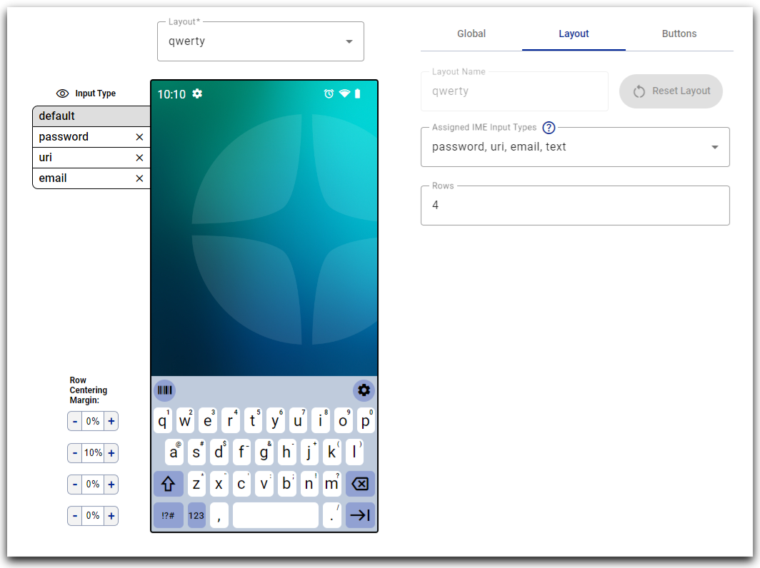
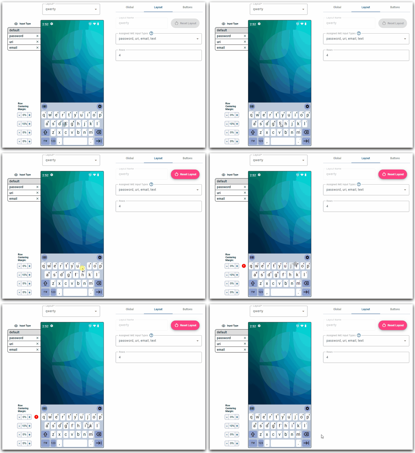
Move Button
Buttons can be dragged & dropped to change their position within the layout.
Input Type Controls
A layout's rows and buttons stay consistent between input types, but individual buttons can have their behavior specialized per input type. It is possible to view the behavior of a layout between different input types by selecting one of the listed input types to the left of the device. Please refer to the input type override section on how to add additional input types.
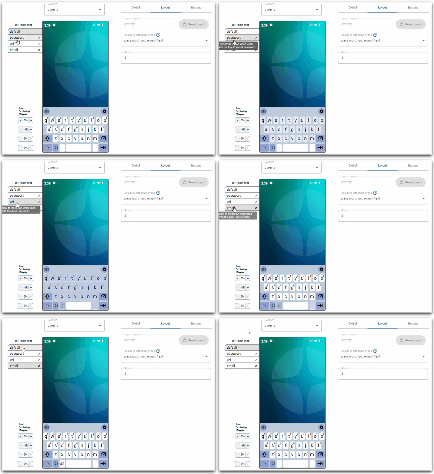
The 'default' option is the behavior of the button if the IME receives an input type the button is not specialized for. Additionally, input type specialization for specific input types can be removed for an entire layout by clicking on the 'X' icon.
Choose Layout
The user may change the displayed layout by clicking on the layout dropdown menu. If a layout is a built-in layout, it will have a 'default' badge associated with the layout in the dropdown menu. If a built-in layout has been modified by the user, a 'modified' badge will appear instead.
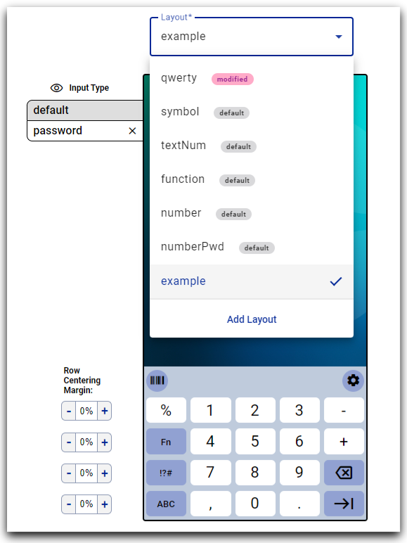
Add Layout
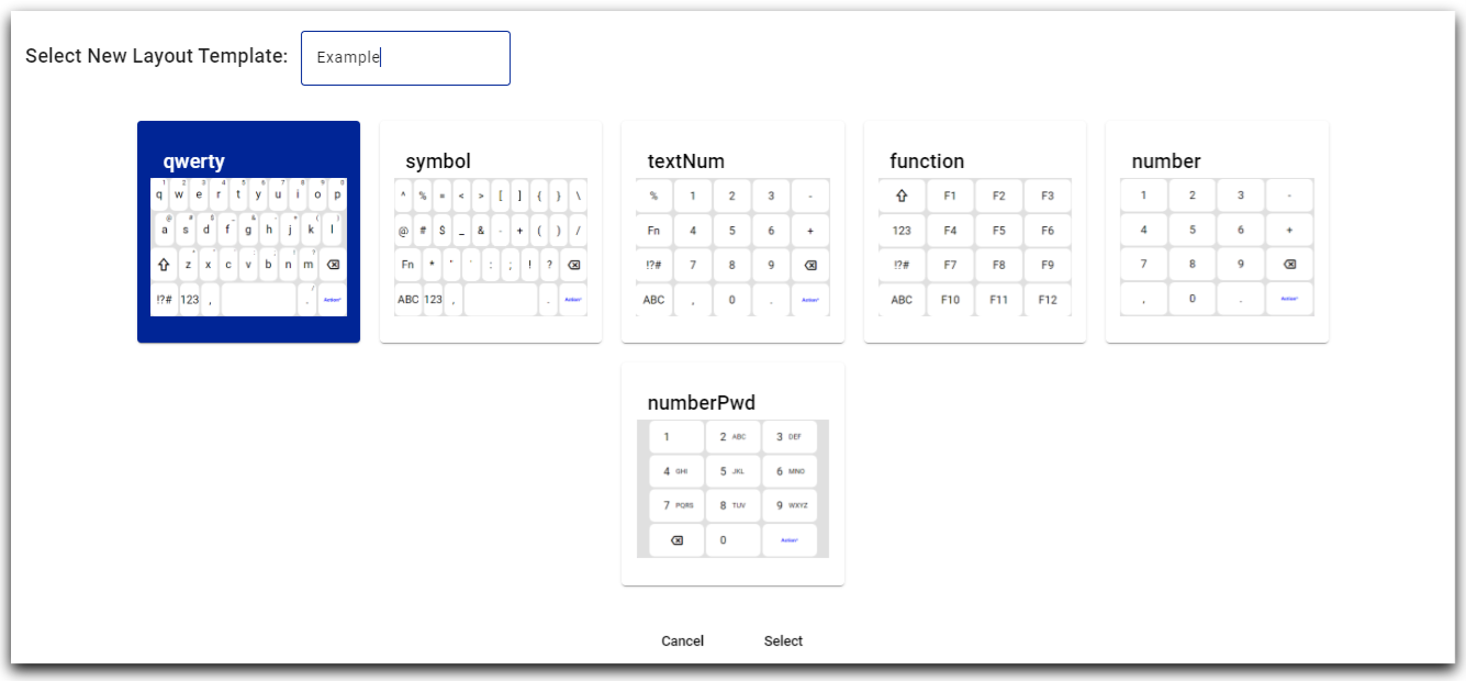
At the bottom of the layout dropdown, there is an 'add layout' button, which allows the user to add an additional layout to the keyboard. When the button is clicked, a modal window is launched where the user can provide the layout a name and select from a list of built-in layouts as a starting point for the new layout.
Row Centering Margin
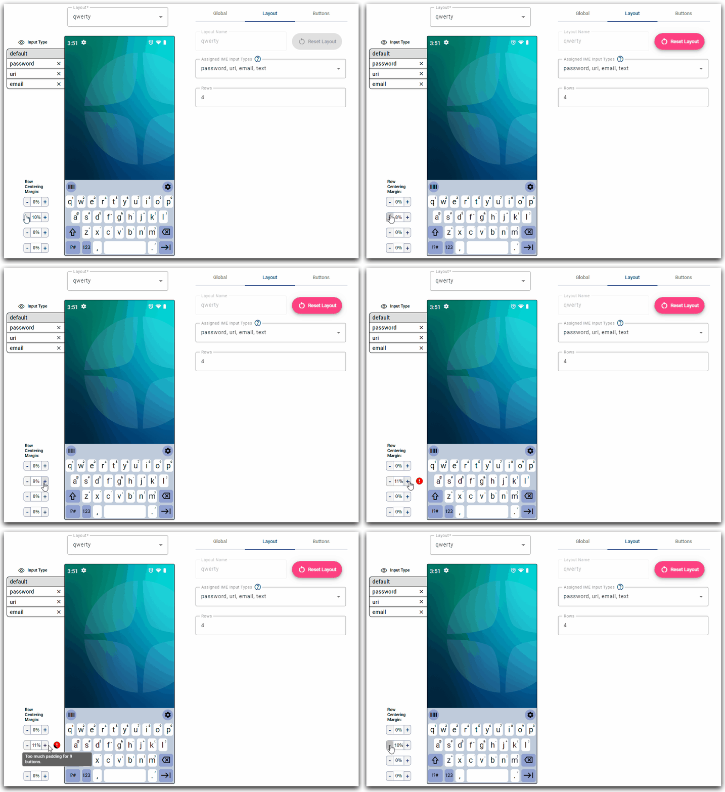
The user may center the buttons by toggling the row centering margin controls. Buttons need to be at least 10% of the screen width (20% for telephone buttons). Therefore, row centering margin must adhere to the following formula:
Global
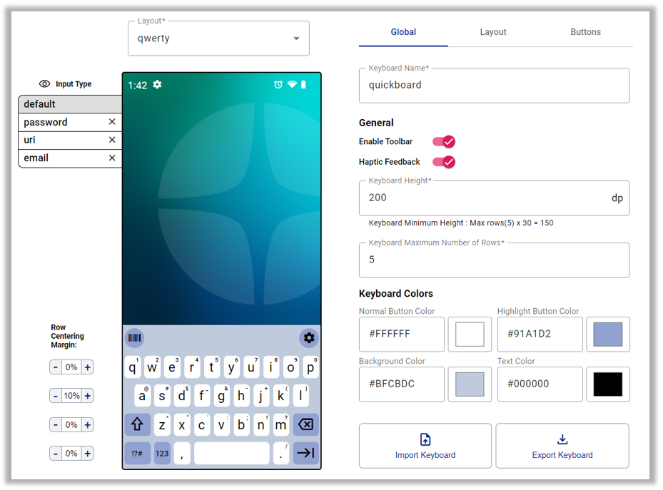
The global tab consists of settings which are related to the entire keyboard and affects every layout.
Keyboard Name
This is the user friendly name of the keyboard.
General
Toolbar
When enabled, the toolbar will appear above the keyboard layouts. The toolbar includes two buttons:
- Scan button: Display the scan button layout.
- Settings button: Display QuickBoard settings.
Haptic Feedback
When enabled, the device will vibrate when a key is pressed.
Keyboard Height
The overall height of the keyboard in dp.
Keyboard Maximum Number of Rows
The maximum number of rows a keyboard layout can support. Lowering this lowers the Keyboard Minimum Height.
Keyboard Colors
A number of the colors of the keyboard can be customized. They are set with six hexadecimal digits, that can be set with the individual color pickers.
Normal Button Color
The color of the regular buttons of the keyboard.
Highlight Button Color
The color of special buttons - Tab, Shift, Enter, Backspace, Action, & Switch.
Background Color
The background color of the keyboard.
Text Color
The text color of both normal and highlight keyboard buttons.
Import/Export Settings
For the purpose of supplying 3rd party EMM's QuickBoard configurations, we have buttons to import/export QuickBoard configurations.
Layout
The Layout tab consists of settings applicable to the currently selected layout.

Layout name
The name of the given layout. Built-in layout names cannot be modified.
Reset/Delete Layout
If the layout is a built-in layout that has been edited, it is possible to return to the default state by clicking the 'reset layout' button. Alternatively, if a layout is a custom layout, it is possible to remove the layout by clicking the 'delete layout' button.
Assigned IME Input Types
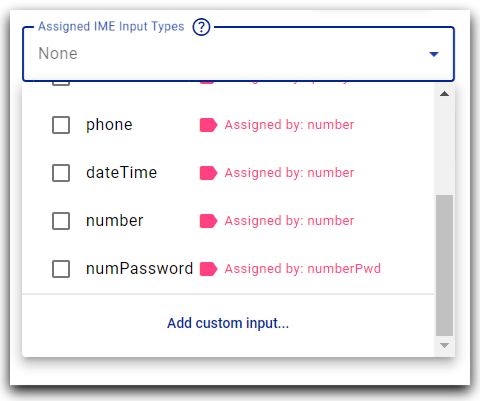
When an application's input field receives focus and calls the systems IME, it can provide the IME with an input type to help indicate the desired use. By assigning these IME input types to a specific layout, the user is specifying which layout will be displayed when an input field on the device gains focus and requests the system IME. More information regarding input types can be found by reading the Android Developer documentation on this topic.
QuickBoard maps Android input types to a simplified list of input types:
| QuickBoard Input Type | Android Input Type |
|---|---|
| text | text, textCapCharacters, textCapWords, textCapSentences, textAutoCorrect, textAutoComplete, textMultiLine, textImeMultiLine, textNoSuggestions, textEnableTextConversionSuggestions, textEmailSubject, textShortMessage, textLongMessage, textPersonName, textPostalAddress, textWebEditText, textFilter, textPhonetic |
| uri | textUri |
| textEmailAddress, textWebEmailAddress | |
| password | textPassword, textVisiblePassword, textWebPassword |
| number | number, numberSigned, numberDecimal |
| numPassword | numberPassword |
| phone | phone |
| datetime | datetime, date, time |
Every built-in input type must have an assigned layout so QuickBoard is correctly displayed for each input scenario.
Custom IME Input Types
Additionally, a user may add a custom input type by clicking the 'add custom input...' button at the bottom of the assigned IME input types dropdown. The QuickBoard app will use the custom input type if an input field sets its privateImeOptions property to the same string (see the QuickBoard Integration section for examples). The name of the custom input type may be anything that does not conflict with the built-in types.
Rows
The number of rows of the given layout. Valid range is 1-5 rows.
Button
The button tab consists of controls applicable to an individual button, and allows the user to make modifications to the current selection.
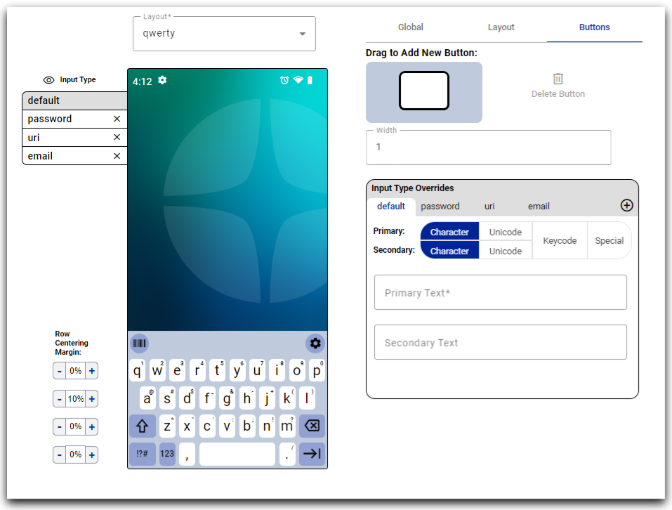
Add Button
To add a button, drag & drop the new button into the desired row and position. When no buttons in the current layout are highlighted, this new button holds focus and can be edited with the button controls.
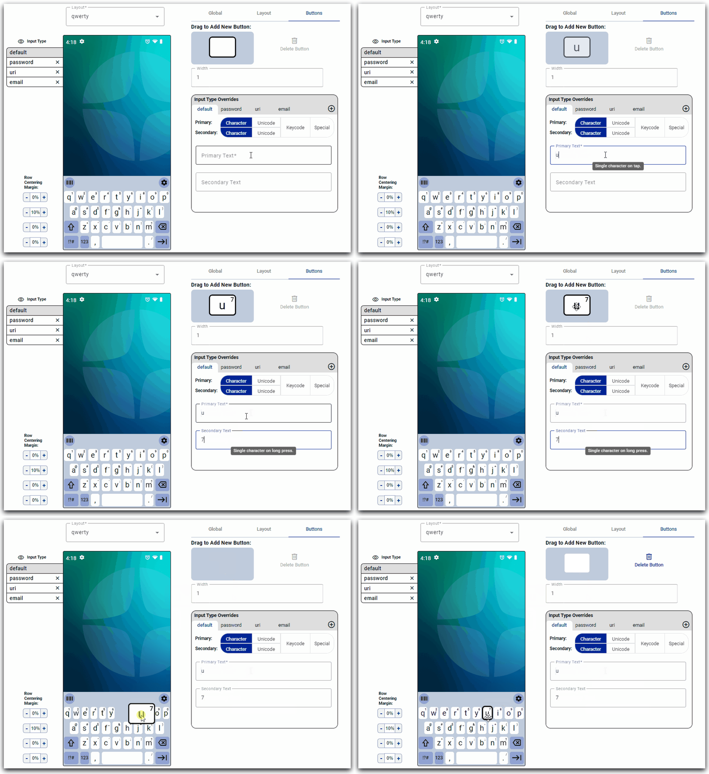
Delete Button
Delete the highlighted button from the layout.
Width
The width of a button as a weight. Each button in a row has a weight. To calculate the width of an individual button, the percentage of a given button's weight that is the total weight of all the buttons in the row, minus the row centering margin, will give the width of button as a percentage of the device's screen width. Some examples:
- if a row has zero row centering margin, and 10 buttons each with a weight of 1, each button will be 10% of the device's screen width.
- if instead, there is a row with 10% row padding and nine buttons each with a weight of 1, each button will again be 10% of the device's screen width.
Input Type Overrides
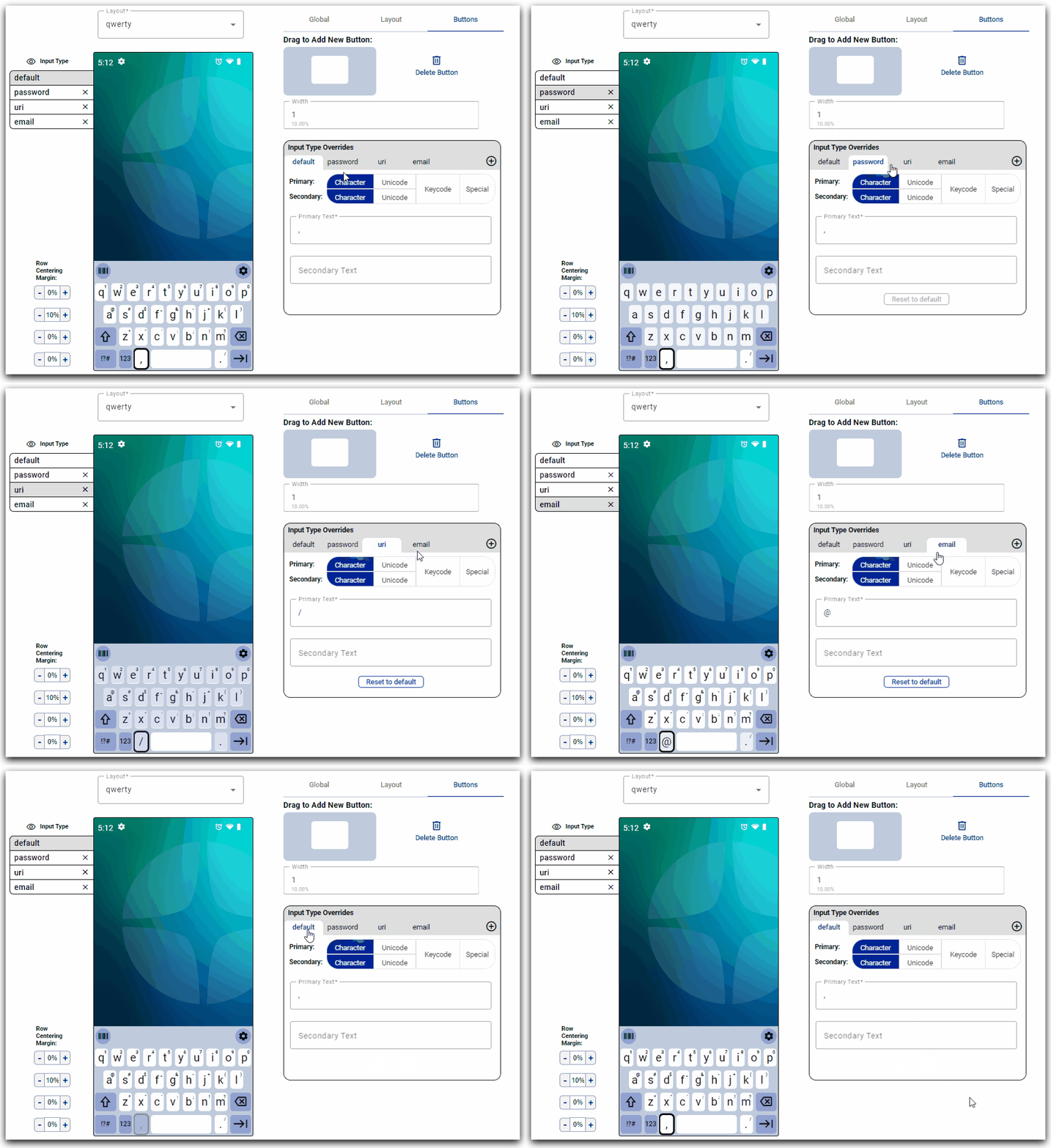
Individual buttons of a layout are able to have different behavior depending on the input type sent to the IME. It is possible to switch between the different input types and customize the button's output. Unless an override value is specialized, a button's override value will track the button's default value.
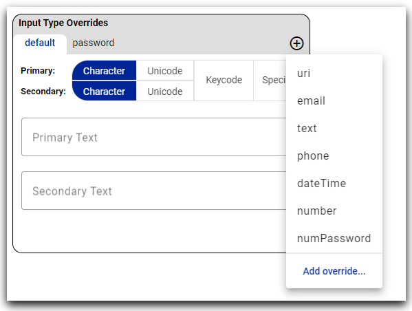
Additional input types can be added by clicking the '+' icon. The 'add override...' button, at the bottom of this dropdown, is an additional method of adding a custom input type. Custom input types can be assigned to a layout, but this is not required in order to be used as an override.
Reset to Default
Selecting the 'reset to default' button causes the current button's override value to sync with the default override.
Button Output
A button can hold a primary output, which is expressed when the button is tapped, and a secondary output when the button is long pressed. There are four categories to choose from when selecting a button's output:
Character
A single character. Can be specified for either primary or secondary output.
Unicode
A single character defined by four hexadecimal digits. Can be specified for either primary or secondary output.
Keycode
An Android keycode, with a label of up to five characters. Can only have a primary output.
Special
A selection from the specified list. Can only have a primary output.
| Special Button | Description |
|---|---|
| Tab | Output a tab on press. |
| Shift | Sticky shift key. A single press for the shift key (auto un-shift after next key press), double-press to lock the shift key. |
| Space | Output a space on press. |
| Backspace | Erase the symbol before the cursor on press. |
| Action | Perform the IME action, determined by the calling input field. |
| Switch | Change the current layout. Requires both a label for the key and the name of the layout target. |
| Telephone | A number key with the associated phoneword. Output the given number on key press. Requires a number 0-9. |