Appearance Settings
Overview
The sheet at the bottom of the Home Settings screen provides controls over the visual appearance of the Home Screen. It can be expanded by dragging up the gripper at its top center, and can be collapsed by dragging it down. The bottom row of the sheet contains buttons which select from different groups of controls over the appearance: Background, Icons, Title Bar. The top portion of the Home Settings screen is updated as the controls are changed to provide instant feedback for how the Home Screen will appear.
Background Settings
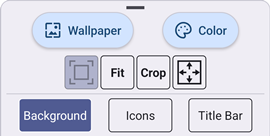
Selecting the Background control group provides control over the Home Screen background. The following options are available:
| Option | Description |
|---|---|
| Wallpaper | This button selects an image to use as the background wallpaper. |
Center ( ) ) | This displays the wallpaper image as centered, without any resizing. |
| Stretch To Fit | This displays the wallpaper image as centered, and resized to reach the nearest display edge. The original aspect ratio of the image is preserved, which can result in bands of the background color visible on the horizontal or vertical edges of the image. |
| Stretch To Crop | This displays the wallpaper image as centered, and resized to reach the farthest display edge. The original aspect ratio of the image is preserved, which can result in cropping of the horizontal or vertical edges of the image. |
Fill ( ) ) | This displays the wallpaper image as centered, and resized to fill the entire display. The original aspect ratio of the image is not preserved. |
| Color | This button selects the background color. |
Selecting a Wallpaper Image
To select an image for the background wallpaper, tap the Wallpaper button. This displays a window showing all available images on the device. The images shown to select from are taken from the public "Downloads" and "Pictures" folders on the device. These are the locations where image files are typically downloaded from a browser (or similar application), and can be viewed by launching the standard Files application on the device. Supported image file types are PNG, JPG and BMP. To remove a wallpaper image, so that the entire background is a single color, see the next section on selecting a background color.
Once a wallpaper image is selected, the color and size are automatically adjusted, as needed, to match the contents of the image. The background color is changed to a value which best blends with the edges of the image. This works best with an image that contains a solid color at its edges. The image size may also be adjusted to use stretch sizing to prevent clipping an image which is larger than the screen. The controls for size and background color can still be altered indepedently after an image is selected.
Selecting a Background Color
To select the background color, tap the Color button. This displays a dialog with Red/Green/Blue slider controls which can be adjusted to change the hue of the background color. The background color is visible in any area of the wallpaper image which is transparent or outside the image. The dialog also includes a toggle to remove any background image that may currently exist.
When the background color is changed, the color of the icon labels is also automatically changed to either white or black. The exact color is chosen based on an attempt to keep a high contrast between the background and text colors. The label color may still be adjusted to a different color within the Icon control group.
Icon Appearance
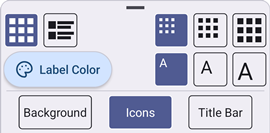
Selecting the Icon control group provides control over the appearance of app icons on the Home Screen.
Layout
The top leftmost pair of buttons control the layout of the icons. The following options are available:
| Option | Description |
|---|---|
| Grid | The icons are arranged in a grid. Icons are listed in order, left to right, top to bottom, with the labels shown immediately beneath their icon. |
| Rows | The icons are arranged in a vertical list. The labels for each icon are shown to the right of their icon. |
In both layouts, the Launcher Settings icon (if visible) is shown as the last item in the list.
Icon Size
The top right contains two sets of buttons which control the size of the icons. The first set affects the size of the icon images, and the second set affects the size of the icon labels. Each set operates independently. Both sets offer size options of small, medium and large.
The icon image size will have an impact on the overall size of each icon, and therefore the position of icons within the selected layout. The icon label size will generally attempt to fit within a similar bounds of the image. This can mean that the label text may split across multiple lines.
Selecting an Icon Label Color
To select the color of icon labels, tap the Label Color button. This displays a dialog with Red/Green/Blue slider controls which can be adjusted to change the hue of the label text color.
Icon Position
The position of each icon is defined by the selected layout, but also by the order of the icons. The order of the icons can be altered from this screen. To move an icon, start with a long press on the icon, move your finger to drag it to a new position in the list, and finally lift your finger to finalize the new icon order.
The Launcher Settings icon, if visible, is forced to be the last item in the list. It's icon cannot be moved, and any attempt to move an icon after it in the list will result in placing the icon next to last in the list.
Title Bar Settings
Selecting the Title Bar control group provides control over the appearance of the Home Screen Title Bar. If no Home Screen title is defined, the controls are blocked. To define a title, tap the Settings icon ( ) and select User Interface.
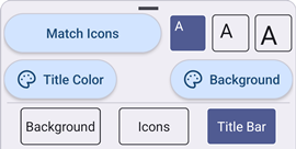
Match Icon Appearance
Tapping the Match Icons will copy the title bar appearance from the related settings of the app icons and background color. These values may still be adjusted individually using the other controls in this group.
Title Bar Size
The top right contains a set of buttons which control the size of the title bar text. Like the app icons, the size options are small, medium and large.
Selecting Title Bar Colors
To select the colors of the title bar, tap either the Title Color (for text color) or Background (for background color) button. These each display a dialog with Red/Green/Blue slider controls which can be adjusted to change the hue of the corresponding title bar color.